
Thursday, December 9, 2010
Thursday, November 25, 2010
Peacock?!! What the--?!


I know, I know right? Not exactly the normal fair for this blog. Oh well a commission IS a commission. Enjoy the progress while I get this monkey... er peacock off my back!
Wednesday, November 24, 2010
Friday, November 5, 2010


Wednesday, October 20, 2010


Wednesday, October 6, 2010

Monday, October 4, 2010
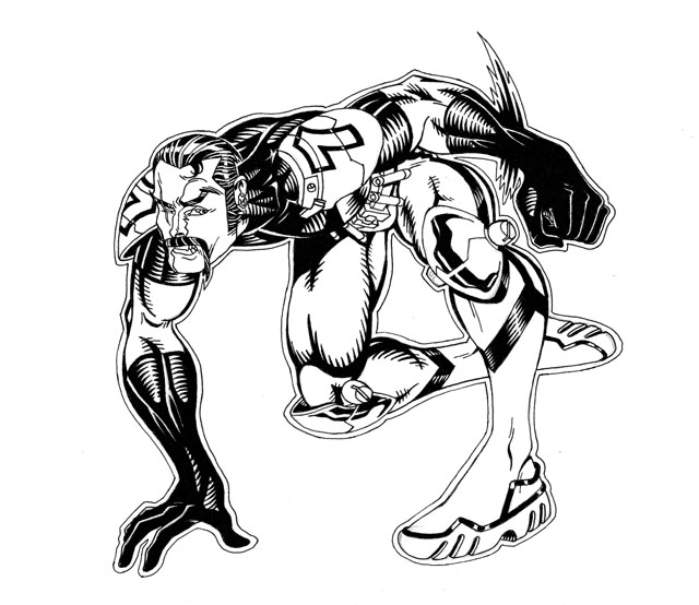
This is Vector...

Needless to say, Vector is a super speedster. But he's not the only member of Sanction 7 that possesses incredible speed...
Sunday, October 3, 2010

Thursday, September 30, 2010
Pieces of the puzzle


I don't normally work this way but I was thinking of a excuse to use my Manga University I.C Background Collection Workbook. [That's quite a title isn't it?] Anyhoo, Space Station Orbiter is about more than a space station, more than paranormals with amazing powers. It also involves giant mechas called "Dreadnaughts". I've said it before, but it bears repeating Orbiter is my love letter to science-fiction space opera, super-heroes and giant robots. I've shown the station, the aliens, members of the Sanction 7 team but I'm overdue in illustrating the mecha aspect solely by itself. So here's the first of several illos focusing on the scale and the threats these robots will be facing. Enjoy!
Wednesday, September 29, 2010

Sunday, August 15, 2010

Wednesday, August 4, 2010
This is Red Zephyr. I've always liked the name "Zephyr"... it just sounds cool. Yet another member of Sanction 7, she has the ability to generate winds and can control the weather. The only member that can fly under her own power without the help of technology. She's also the only member that sports a cape. Considering her power it almost felt appropriate...


Evolution of StealthShadow


This is StealthShadow. Probably the very first character I created for Space Station Orbiter: Cloud 99 many many, years ago... Powers are pretty straightforward, she has the ability to both phase and turn invisible. I really liked how this particular piece evolved... I'm just really digging the effortless laid back body language she's evoking in this illustration. She's a cool coy chick this one...
Wednesday, July 28, 2010

Saturday, July 17, 2010

Saturday, June 12, 2010

Friday, June 11, 2010
I'm Not Fearless


I'm not fearless. You know the type of artist I'm talking about. The kind that takes to the bristol and starts drawing with nary a sketch or thumbnail to guide them. I've always been a little envious of that ability. Just doesn't work for me. I literally have to work out all the kinks before I really commit to good paper. I guess I'm a control freak, and that characteristic shines through even when I draw. Sigh.
Perhaps that's why I enjoy sketching initially in ballpoint pen on plain old printing paper. It's probably when I'm most free... unafraid to make a "mistake". I don't really care about correct [or even stylized anatomy for that matter] at that point. I'm just trying to get the "gesture" or the "feel" of the drawing. After that, I break out the tracing paper and start refining. What I sometimes lose in spontaneity I make up for in polishing the final product before I EVER commit to good bristol. Pro and cons to everything I guess...
Sunday, June 6, 2010
Work in Progress Part 2

First off, I really need to give props to Brian Bendis and John Romita Jr. I thought their ad campaign to introduce the new Avengers team was a stroke of genius. A brief sentence boiling down the essence of each new Avenger's character. Robert Kirkman's no fool, he knows a good idea when he sees one. He immediately used a similar approach to introduce his new Guardians of the Globe line-up. It was just as cool the second time around, and probably even more important to do, as several of these characters had never been seen before.
I've been living with these Sanction 7 characters forever and a day now, but know one else really knows these characters at all. I figured the "Bendis New Avenger Intro" was a interesting exercise to try out. I REALLY enjoyed it! It helped me get a more concise handle on my own creations. Boiling down their motivations, hopes and fears in a few sentences. I have quite a few to do, so interspersed between other illos I'll be rolling out these ads all summer.
As for the actual execution of the piece, even though I liked the ad campaign I really didn't want to replicate it exactly. I needed to put my own design spin on it. The piece was colored in photoshop. I decided to go with the exact opposite of the white negative space of the Avenger ads which meant using a lot of black as a back drop. Then I thought, what the hell, as a added design element I would use a photo or backdrop image that best describes the character's power. A warped photo of volcano plumes worked nicely. And because I can never leave well enough alone I took the original black and white illo, blew it up and inverted the image to create a "negative" background. Initially it was too stark and fought waaaay too much with the character caption. So I brought the opacity of the negative figure to about 45% and that seemed to work out just fine. Run the title text at the bottom and the puppy is complete. Shake, stir...and serve chilled. Enjoy!
Saturday, June 5, 2010
Work In Progress Part 1


I'm back to my world building folks. The Sanction 7/ECBACC mash up piece was just the warm up. There will always be little artistic detours here and there but for the most part I'm back to focusing on artwork that actually pertain to this blog's title! Just don't expect any real order or rhyme or reason.
This character's name is FyreFist. He's one of the leaders of Sanction 7. His current mission along with his teammates is to provide added protection to the Space Station entitled Orbiter 99. Overall, I was pretty happy with the overall figure sketch, except I thought his head was a little small. So I enlarged his noggin just a bit.
Monday, May 24, 2010
Black Jesus colored! [Hmmm... something's disturbing about this title...]

Seb asked me to illustrate this piece awhile back. It was always intended to be black and white with just a hint of color. But recently I decided to see what it would look like fully colored. I'm rather happy with the results. Enjoy!
Sunday, May 23, 2010
Blast from the past Part 3

For whatever reason, I started this illustration at the beginning of the decade and never finished it. Going through my files I came across it, warts and all and reaccessed the illo. Eh. It wasn't THAT bad... So I figured, what the hell, finish the color and simply say, "Happy 30th anniversary to THE EMPIRE STRIKES BACK!" My all time FAVORITE STAR WARS movie!

Blast from the Past part 1

Three guesses as to whom inspired this piece. [And the first two don't count!] Colors by the incomparable Sky Owens...
Wednesday, May 19, 2010

Sunday, May 16, 2010
Sanction 7/ECBACC Mash up!

Just because I didn't attend the ECBACC doesn't mean I can't show some LOVE!
Wednesday, March 17, 2010


Kubcake and the DurtyBear Odyssey
Finally. The light at the end of the tunnel.
Last year I was working hard on self publishing my own comic Space Station Orbiter: Cloud 99. I created this blog to both self motivate myself and to let others interested in comics on my creative process. I was very much inspired by the many artist blogs and websites that you see listed to the right. As with anything, my personal vision morphed into something else. that "something else" included a past creative endeavor as well. That was Mark Nemesis: The Avatar. For obvious reasons, I've slightly changed that title. Even though I've been living with it for the last ten years. Hard lesson learned folks... you snooze, you lose! Anyhoo, I thought it would be fun to combine both stories into one package. TAYLOR MADE! was born... or at the very least, in the process of gestation.
But life tends to throw you curve balls. Without going into the dirty details, my partner Sebastian Morris presented me with a interesting proposition which I couldn't pass up. Help him create a clothing line for larger, full sized men that was specifically catered to the GAY BEAR community [If you don't know, google it]. Hmmm... help design clothes? Always thought about it, never done it. Seemed like fun, and it was! Still is actually. Mr. Morris is a master textile specialist and seamstress. He had never focused on men's clothing to this degree and wanted my input. We created the line together, although I felt each to his own personal strengths. Deferring to his expertise, I always gave him final say. My job was to create a "brand", a mascot to promote the brand [hence the creation of KUBCAKE] and to create the website. Afterwards it would be my job to promote the site and the clothing line as best I could.
With GRITZ N GRAVY I had to design a book from the ground up... something I had never attempted before. With DURTY BEAR clothing I had to design a website from scratch, something ELSE I had never done. Luckily, I have some VERY talented friends. Herb Briley is one such friend. When I layed out the magazine it was his expertise that took my templates and made them print ready. With the Durty Bear website Herb once again, not only interpreted my vision but enhanced it. I can't thank him enough. He did a fantastic job. As of this writing we're not completely finished but certainly 98% completed. At least I feel comfortable enough for folks to see the work in progress. For those who are interested, by all means take a look.
durtybear.com
Thankfully, as of this writing my job is ALMOST complete with only two more page templates to go. YAY! With that completed I can finally get back to Orbiter and Nemesis. The detour took a little longer than expected but it was a great opportunity to expand and do something I never thought possible. I thank Sebastian Morris for the opportunity and I love him dearly for allowing me to collaborate with him. I hope we continue to collaborate creatively for many, many years to come.
Tuesday, March 16, 2010


Subscribe to:
Posts (Atom)